Business Brochure Color Psychology
Color plays a profound role in shaping our perceptions and emotions. In the world of business, where first impressions matter, understanding the psychology behind colors is crucial for designing impactful brochures.
Unlock the potential of your brand with free brochure templates. In just a few clicks, you can harness the power of color psychology to craft a visually stunning and emotionally resonant marketing piece. In this blog, we’ll explore the fascinating realm of business brochure color psychology, delving into insights that are not only enlightening for marketers but also accessible and engaging for primary school students.
Business Brochure Color Psychology
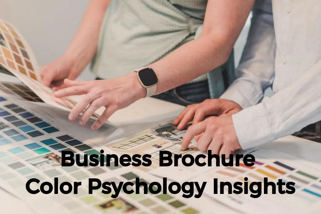
Imagine a world without color – it would be dull and uninspiring. Colors have the power to evoke emotions, convey messages, and influence decision-making. In the context of business brochures, the strategic use of color can leave a lasting impression and communicate a brand’s identity.
Before we dive into the specifics of business brochure design, let’s understand the basic emotions associated with primary colors. This serves as a foundation for comprehending the impact each color can have on the reader.
- Red: Excitement, passion, energy
- Blue: Trust, calmness, professionalism
- Yellow: Positivity, warmth, optimism
- Green: Harmony, nature, growth
- Purple: Royalty, luxury, creativity
- Orange: Friendliness, enthusiasm, energy
- Black: Sophistication, elegance, formality
- White: Purity, simplicity, cleanliness
Choosing Colors Wisely for Business Brochures
The selection of colors in a business brochure should align with the brand’s personality and the desired emotional response from the audience. Let’s explore how each color can be strategically used to convey specific messages.
Red: The Power of Passion
Red is a color that demands attention. It exudes energy, passion, and excitement. In a business brochure, the strategic use of red can highlight important information, grab the reader’s attention, and create a sense of urgency.
Blue: Building Trust and Confidence
Blue is often associated with trust and reliability. Incorporating shades of blue in your brochure can convey professionalism and a sense of calmness. It’s an ideal choice for businesses aiming to build trust and establish a credible image.
Yellow: Sunshine of Positivity
Yellow is a color that radiates positivity and warmth. In a brochure, yellow can be used to highlight key messages, evoke a sense of happiness, and create an overall optimistic vibe. It’s particularly effective in industries related to creativity and innovation.
Green: Harmony with Nature
Green symbolizes harmony, nature, and growth. A green palette in your brochure can convey a commitment to sustainability, freshness, and a sense of well-being. It’s an excellent choice for businesses in the environmental or health sectors.
Purple: Royalty and Creativity
Purple is often associated with luxury, royalty, and creativity. Incorporating purple hues in your brochure design can add a touch of elegance and sophistication. It’s a strategic choice for brands aiming to position themselves as premium or innovative.
Orange: A Burst of Friendliness
Orange is a color that exudes friendliness, enthusiasm, and energy. Including orange accents in your brochure can create a lively and approachable impression. It’s well-suited for brands looking to connect with their audience on a personal level.
Black: Timeless Elegance
Black is a timeless color associated with sophistication and elegance. While it may seem formal, black can be used strategically to create a sleek and modern look in your brochure. It’s often employed in luxury brands and high-end products.
White: The Canvas of Simplicity
White is a color that symbolizes purity, simplicity, and cleanliness. In a brochure, a white background can create a minimalist and modern look. It provides a clean canvas for other colors and elements to stand out.
The Psychology of Color Combinations
Beyond individual colors, the combination of colors also plays a crucial role. Understanding color harmony and complementary pairings can elevate the visual appeal of your brochure. For primary school students, exploring color wheels and simple combinations can be a fun and educational activity.
Putting It All Together: Designing with Intention
Effective brochure design involves not only choosing the right colors but also using them with intention. Consider the emotional response you want to evoke and ensure that your color choices align with your brand identity.
Case Studies: Successful Brochures and Their Color Strategies
Explore real-world examples of successful business brochures and how they’ve strategically employed color psychology. These case studies can serve as inspiration for businesses looking to revamp their marketing materials.
So, the next time you embark on the journey of creating a business brochure, remember that each color has its own voice, and the palette you choose will narrate a story that resonates with your audience, both young and old alike.
Also Read: 10 Kid friendly Dishes for the Youngest Diners to Cherish
Conclusion: Painting Success with Colors
In the world of business brochure design, color psychology is a powerful tool that can shape perceptions, evoke emotions, and leave a lasting impression. As businesses strive to connect with their audience, understanding the language of colors becomes indispensable.
For young minds, this exploration of colors can be a creative journey, introducing them to the exciting world of design and emotions. However, the process of creating brochures can be intimidating and time-consuming.
That’s where the brochure designer comes to the rescue! With the advent of technology, you no longer need to be a design expert or rely on expensive graphic designers to create captivating brochures. Using a brochure designer, you can now effortlessly bring your ideas to life with a few clicks.


